
Overview
Fleet Foot Delivery Co.- Serving The Alaskan Community
Fleet Foot Delivery Co. is a fictional delivery company based in Alaska that needed a logo that visually captured its brand essence—speed, strength, and regional roots. I developed a bold, nature-inspired identity that merges wildlife symbolism with strong typography and a modern visual tone.

The Ask


Design Overlook
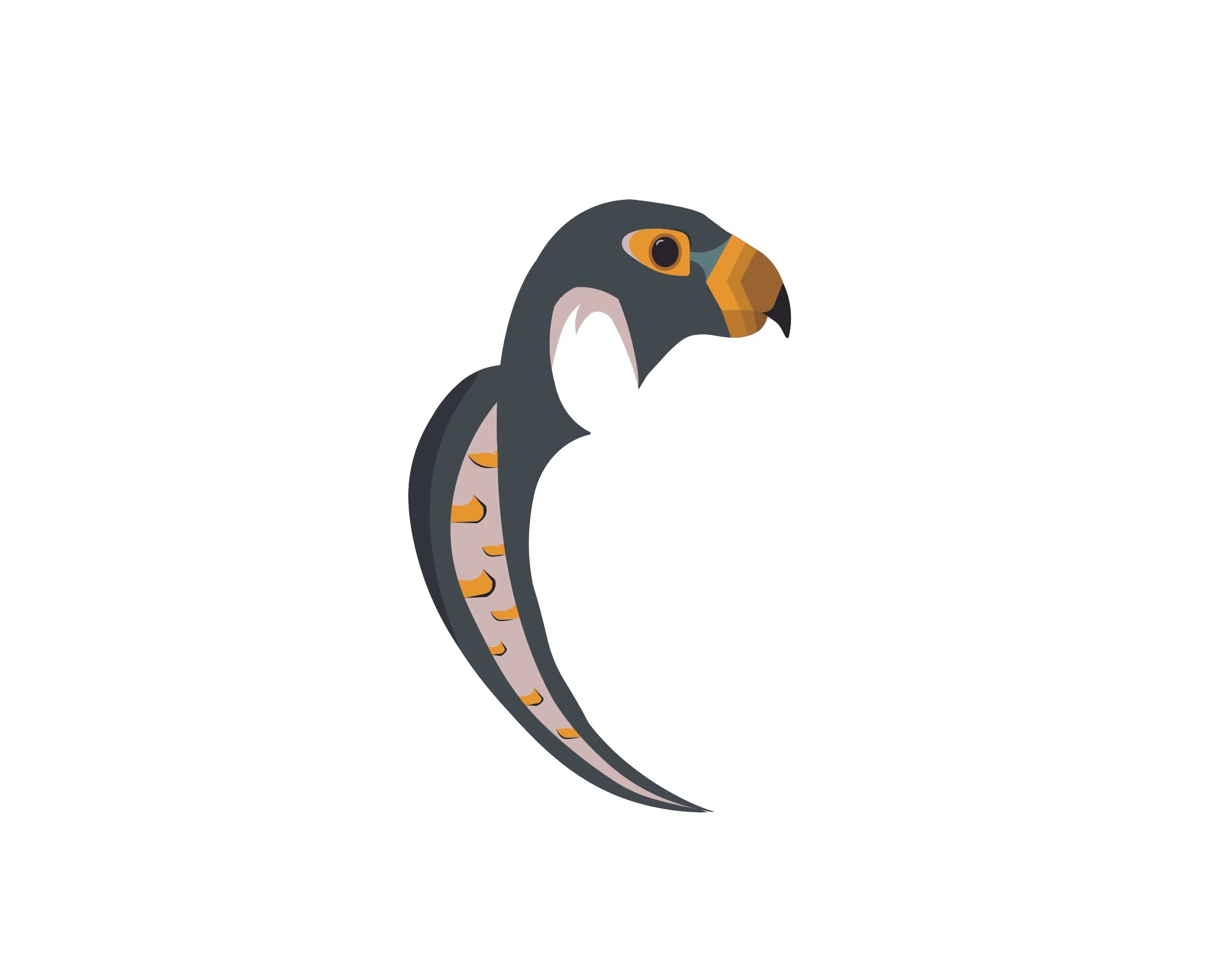
Main Icon:
• A geometric, stylized peregrine falcon in profile
• Layered mountains in muted blues and greens
• Clouds for added depth and setting
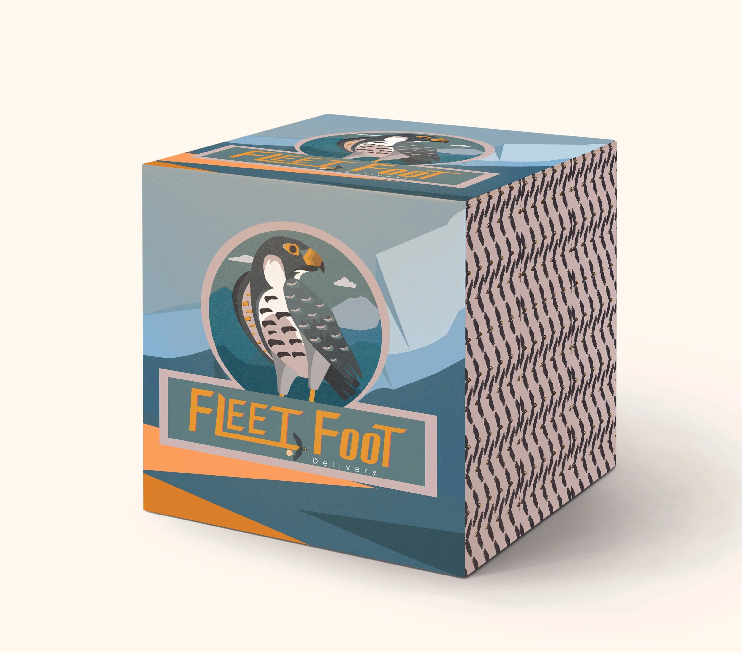
Typography:
• Custom wordmark: FLEET FOOT
• Dynamic angles and sharp cuts to reflect motion and boldness
• Letter “T” subtly designed to resemble a falcon in flight
• Supporting icon of a flying bird used as a secondary mark

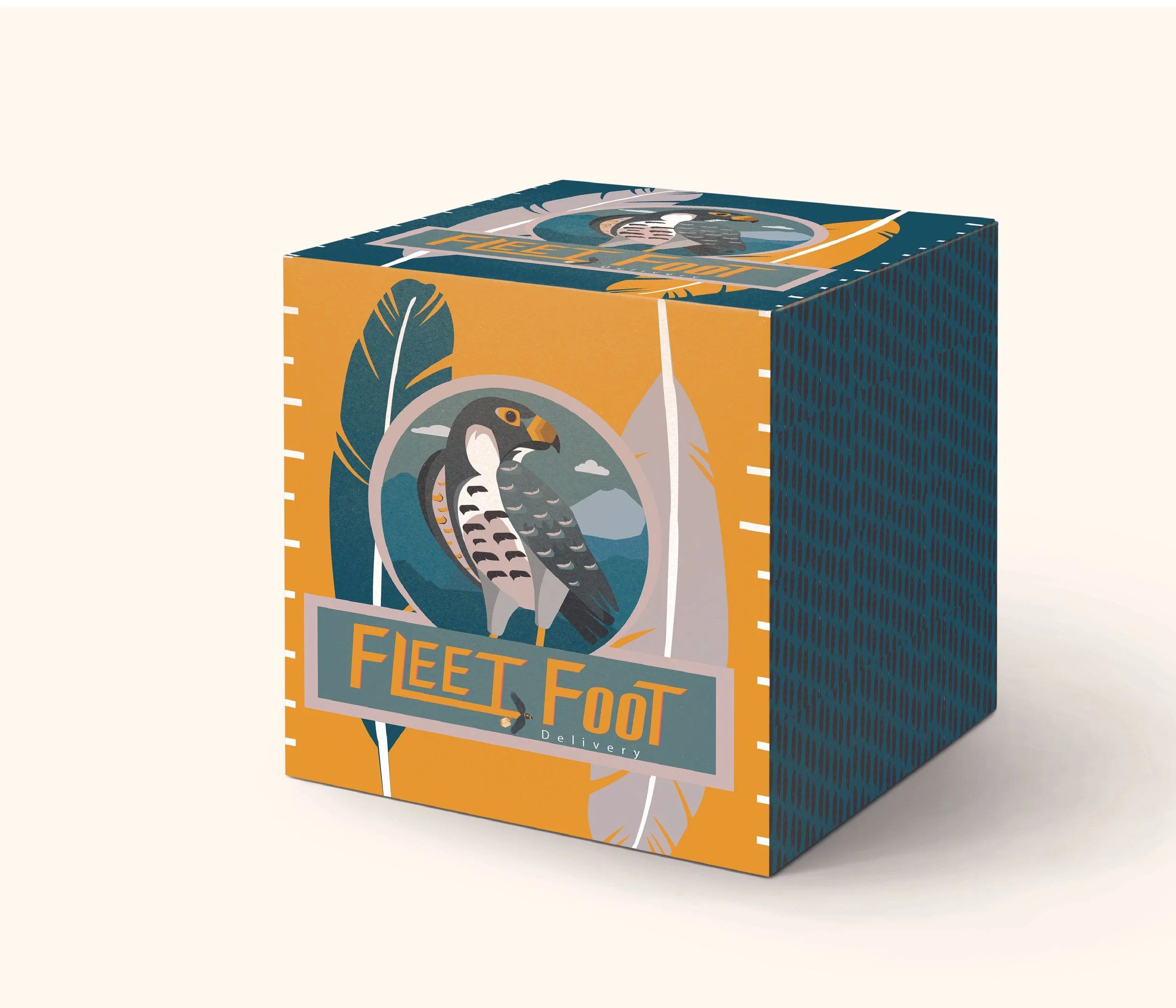
Color Palette:
• Deep forest green background for calm and strength
• Warm ochres and oranges to add contrast and energy
• Muted blues and taupes for a cool, northern atmosphere
